A new set of brand identity of the Vietnamese tourism industry has been concluded but it seems not to fully express the will and aspiration of the tourism industry. The Ministry of Culture, Sports and Tourism has just announced that they would not use the five-colour star-shaped logo and slogan “Vietnam - A different orient” for the next stage of Vietnamese tourism industry. The new campaign to collect opinions and voting for new logo and slogan expressed determinations and progressive spirits for a better trademark for the sustainable development of Vietnamese tourism.
Lack of a vision
The prize-winning prize for making up logo and slogan for the Vietnamese tourism was awarded to Cowan Design Company. The icon inspired from a five-wing star ran into opposite opinions from Vietnamese and foreign individuals who showed their care for the development of the Vietnamese tourism sector.
A majority agreed that the new logo is more professionally designed than the old "Hidden Charm" logo. It is characteristically different from national tourism logos in other countries in the region as it exhibits an eye-catching image and stands out other logos when it is displayed on ad posters and banners or at trade fairs. But basically, the logo image confronts oppositions as it portrays the symbol of colourful zebra. The logo does not represent the symbolic image of Vietnam while it may make people mistakenly understand that this is an African country with zebra symbol.
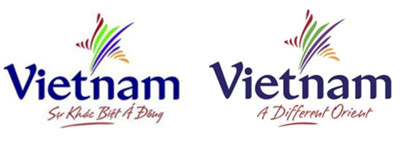
Regarding the colour expression, a lot of colours in use like green, purple, yellow, red and others reflects a lack of colour-dominating orientation of the designer although the use is clearly interpreted: The blue refers to as the water of Vietnam; the green symbolises rice fields, forests and mountains in Vietnam; the purple represents the lotus - a nationally symbolic flower in Vietnam; and the yellow signifies the colonial architecture in Vietnam, and so forth. By this far, many people will wonder why the author deliberately embraced so many meanings onto the logo which are seemingly difficult for a majority of Vietnamese people, let alone foreign tourists. Then, should the author use a dominant colour that symbolises the image of Vietnamese tourism. Taking the blue as example, this colour represents the rich potential of sea tourism in Vietnam where there are more than 3,200 km of coastline and the sea tourism is the main theme of the National Tourism Year this year. And, up to 80 percent of tourists visiting Vietnam go to the sea.
Many travel companies said the fonts used are not very suitable. Perhaps, the designer tries to represent the nature of culture, history and nationality when he/she uses quirks. However, this signification is too symbolic for most tourists who are not artists or linguists to figure out its hidden meanings. In addition, winding characters may be alluded to the “softness and weakness” of the Vietnamese tourism which is described vibrant and potential and is rising to a key green economic sector of the country.
The slogan “Vietnam - A different orient” is a half-Vietnamese and half-English expression, indicating an unclear implication of the designer as he/she suggests more of cultural and human differences than natural and tourism strengths of Vietnam. The theme seems to target at exploratory and adventurous young generations, not a majority with deep keenness on relaxing tours. Furthermore, the wording of “Different” and “Orient” implies mystery and difference of Vietnam while the interpretation of “Different Orient is unclear. Besides, according to a linguist, the slogan Vietnam - A Different Orient" is confusing as it may be translated to be “another orient.” What’s more, the article “a” should not be used as Vietnam is a specific country and a definite entity.
The creation of this logo and slogan shows the lack of a vision of Vietnamese tourism. Allegorically, if the vision must reach 10 years’ time, the Vietnamese tourism industry only goes past 100 metres. Perhaps, the designer should have had a specific plan and action strategy for the creation of a set of brand identity that fit strengths and objectives of the Vietnamese tourism,” said Mr Vu Hoang An, Director of Rainbow Tourism Company.
New logo - How to make?
Now, it is at the middle of the year but the controversy over the logo and slogan is unexpected. Creating a new logo that matches strengths and objectives of the tourism industry is essential although it is a bit late. Creating a logo is a humble job but this is a very important stage in promoting the image of Vietnamese tourism which represents the determinations of the tourism industry on the long road of development.
Therefore, this job should be clearly directed. If we want to establish our national image, we should use a symbol representing the national characteristics. The logo must be impressive and easy to understand, not mysterious, and the slogan must be concise, easy to read and easy to remember.
Mr Hoang Huu Phuoc, General Director of My A Trading Company, said: “Unique identities of Vietnam are not only wonders, landscapes and vestiges that not all nations have, and the specialty is the dignity and spirit of a country with a more than 4,000 year history full of magnanimous and miraculous evidences. Only by identifying and understanding these unique characteristics, can we make Vietnam ‘unique’, ‘amazing’, ‘incredible’, ‘sparkling’, ‘wonderful’, ‘fascinating’, and ‘truly Asia’ - the most unique trait of All Asia: Always rising in the event of constant dominance of Western forces.”
Steven Groff, an American, who has lived in Vietnam for a long time and has good knowledge of Vietnamese tourism, added that a logo does not necessarily use many colours but only one or two are enough. The option depends on the designer. He/she can use the green (rice plant) and yellow (rice straw) to draw a logo because rice is very familiar to Vietnamese people and the blending of the two colours is very impressive, warm and appealing. The slogan must tell “why it is chosen as “a destination, because of cultural, historical or landscape attractions or whatever else.” Vietnam can use a slogan like “'Vietnam - The new Orient” or “Vietnam - The new exotic.”
Some countries in the region are very successful at creating logos and slogans and using them as marketing tools. Vietnam can refer and learn from them like ‘Amazing Thailand’, ‘Incredible India’, ‘Fascinating Malaysia’, ‘Uniquely Singapore’, ‘Cambodia Kingdom of Wonder’, ‘WOW Philippines’, etc. These logos and slogans are short, concise and artistic.
Finally, “before choosing the logo and slogan for the tourism industry, [authorities should] widely publicise or poll opinions from experts, businesses, etc. Once chosen, they must be broadly introduced on mass media. Half of the year has elapsed but the tourism industry still has nothing for this year promotion,” said Mr Nguyen Cong Hoan, Deputy Director of Hanoi Redtours Travel Centre.
Hopefully, the Vietnamese tourism industry will eventually build up a new logo and slogan that come up with expectations of the people and create new momentum for the industry to make headway.
Thu Huyen


 April 24–25, 2026
 Kinh Bac Cultural Center, Bac Ninh Province